Eversource Energy Utility Portal| Customer Facing
Company Eversource | Industry Energy | Platform Mobile Responsive Web App
Overview
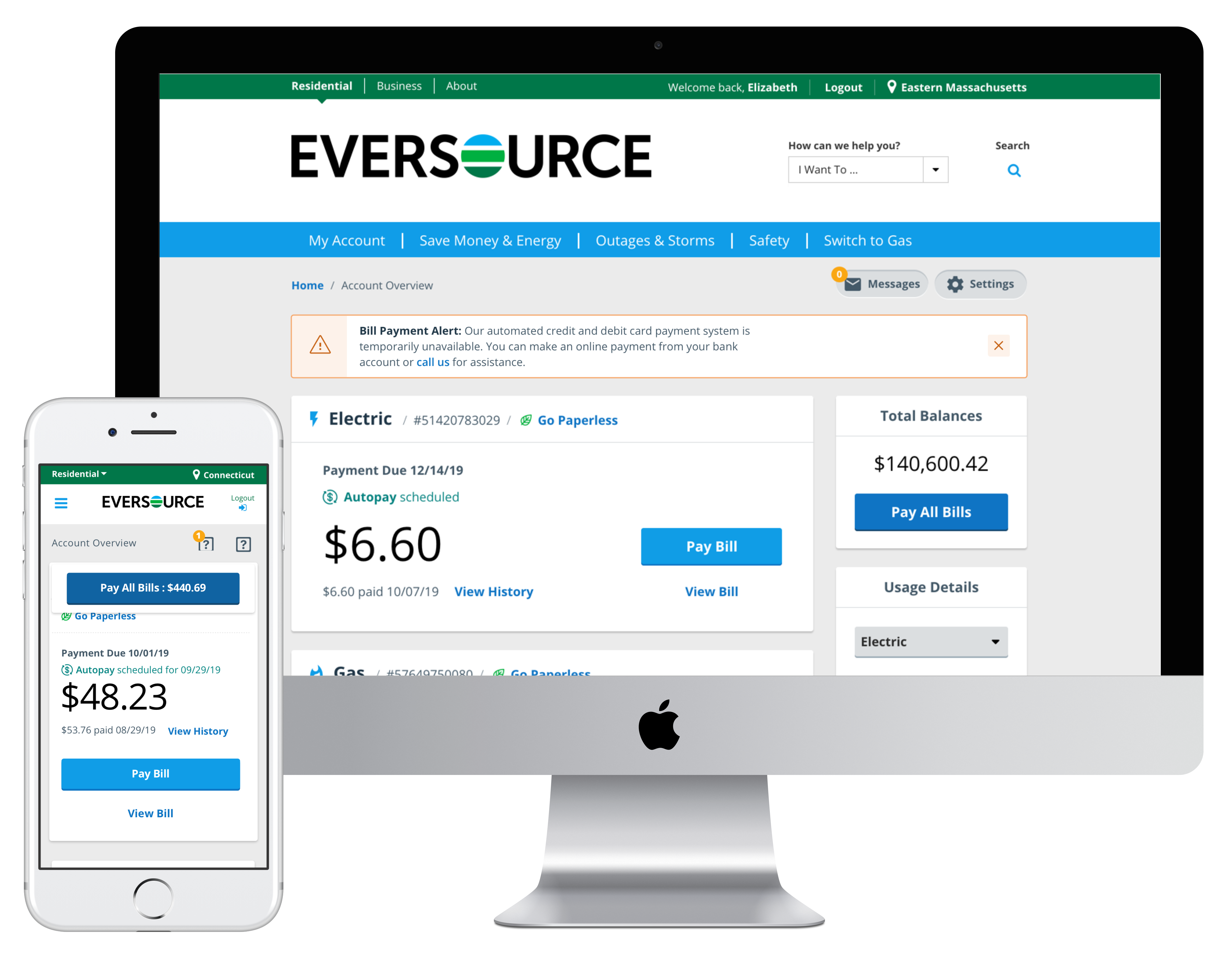
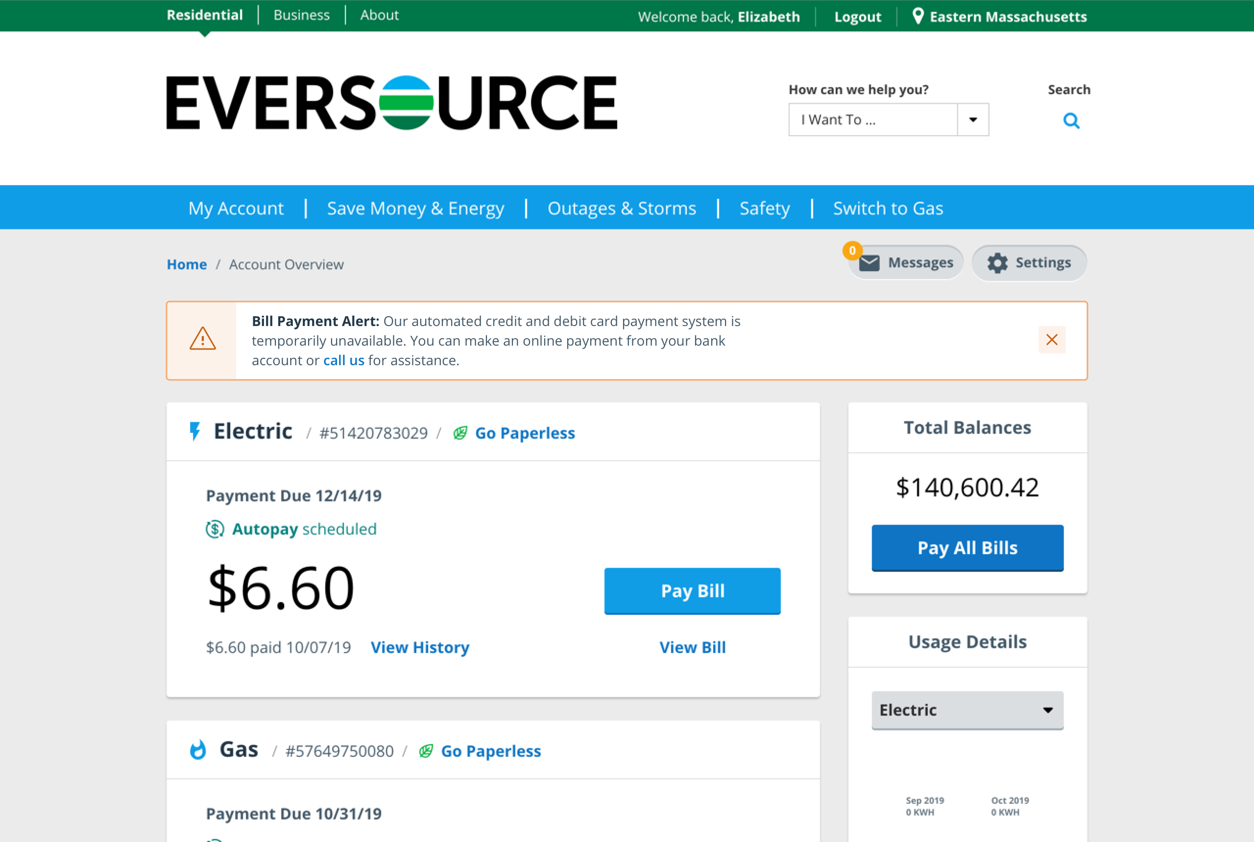
Eversource is an energy provider serving customers in Connecticut, Massachusetts, and New Hampshire. Customers can access their residential accounts, report outages, make payments, and more.
Role
UX Designer
Contributions
Product Strategy | User Research | Interaction | Visual Design | Prototyping & Testing | Information Architecture
Features worked on
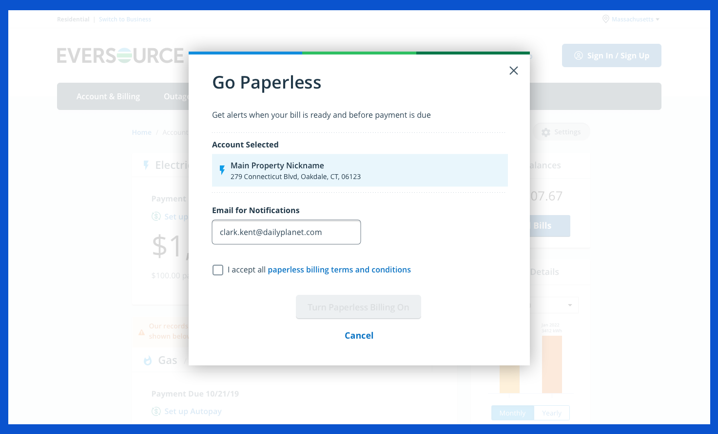
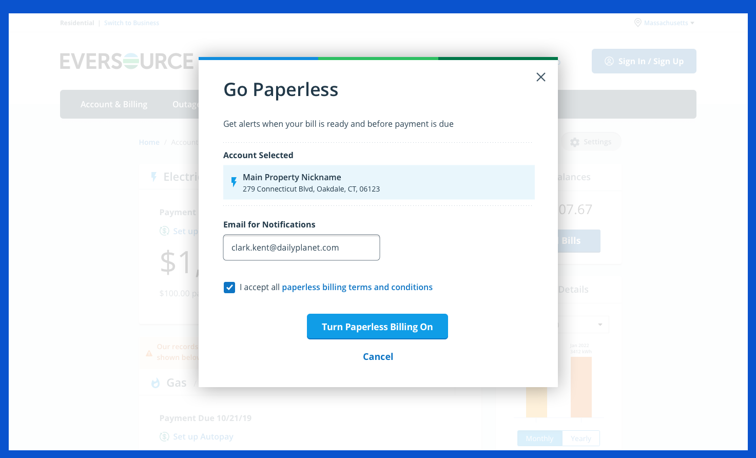
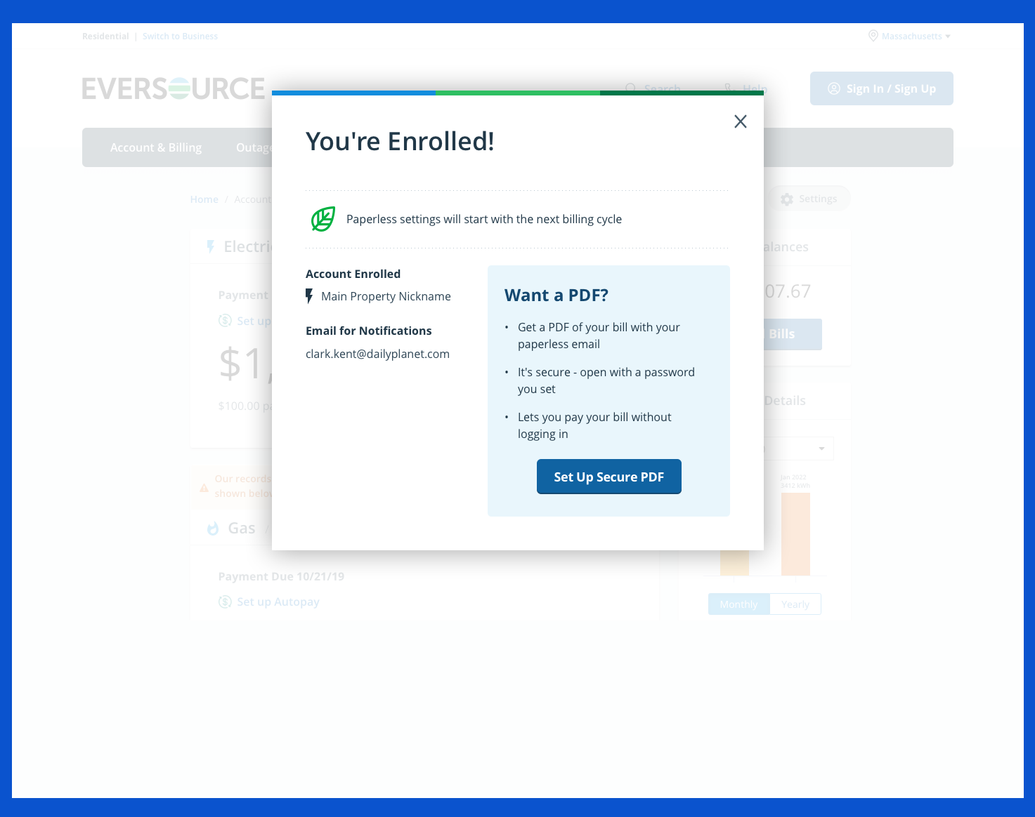
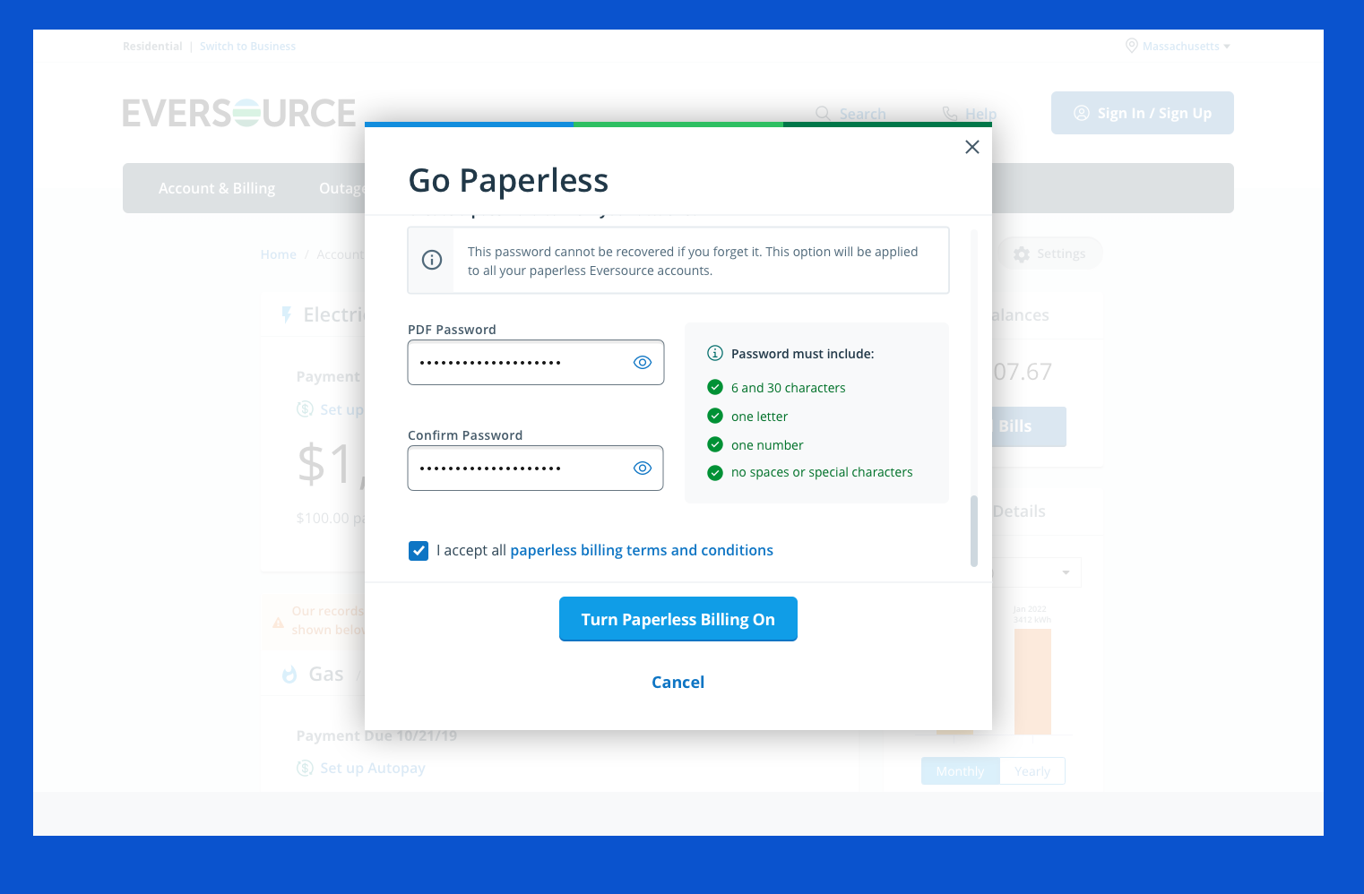
Paperless Billing
- A quick, easy, and straightforward way for participants to go through the process of enrolling in paperless without in-page distractions
Secure PDF
- To increase paperless enrollment, focus on improving the Secure PDF enrollment feature on the website, as just 2% of customers used it.
Next Best Action
- Provide customers…
- An easy way to discover and view web tools and insights
- Personalized, targeted measures to help save energy and money
- Help utilities…
- Cost-effectively market energy programs based on customer attributes and segments
- Boost customer satisfaction with the online portal
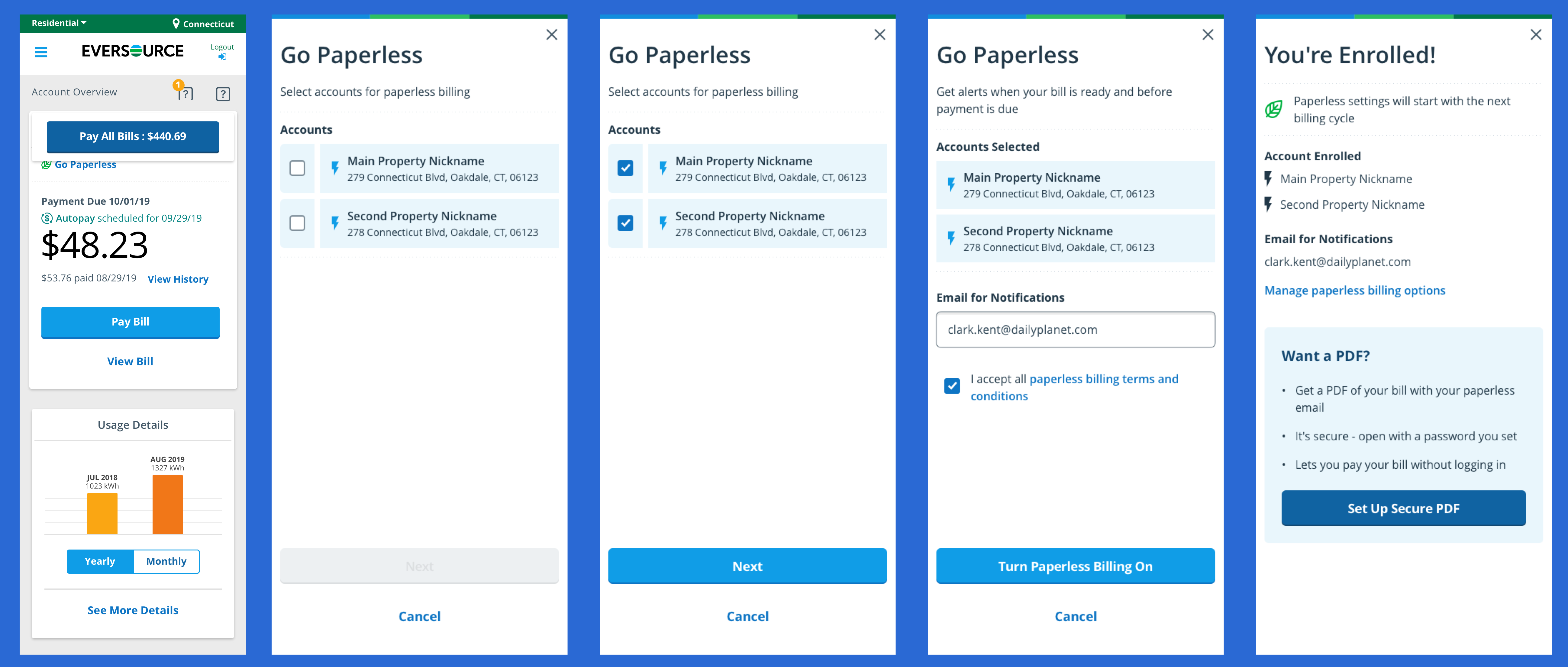
Paperless Billing
Mobile Responsive Version
UX Goals
- Assess why customers do or do not sign up for paperless billing
- Usability test (1) the current paperless enrollment process versus a new modal-passed process; (2) a new paperless confirmation email; and (3) a new paperless bill email
Business Goals
- Enable customers to self-service their accounts online and reduce phone calls to Eversource
- Reduce costs for mailing out paper bills to customers and processing mailed payments
Methodology
- Recorded Usability Sessions with recruited Eversource customers. Sessions were remote.
Findings
- Most participants preferred the new paperless enrollment process. Participants appreciated the new modal-based prototype because it was quicker, more efficient, and had fewer distractions than the current process.
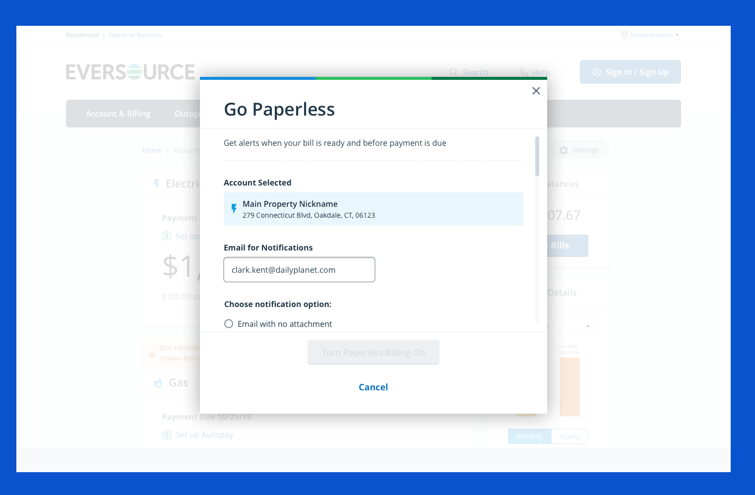
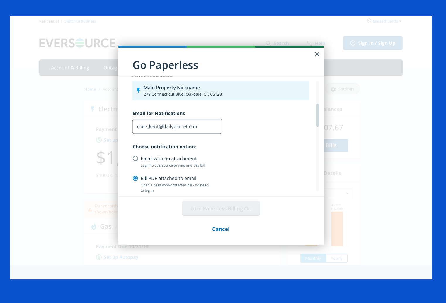
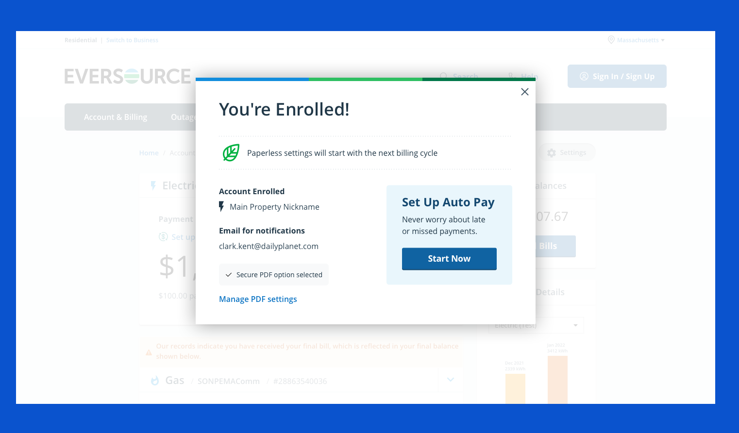
- The option to enter a different email to receive paperless bills caused some confusion. Some participants had to pause and consider updating their email address in their account settings if they wanted to change their email during the paperless enrollment.
- Some participants desired an incentive to sign up for paperless. Suggested incentives included a discount on their monthly bill, a credit on their bill, or a free home energy appraisal.
- Most participants anticipated receiving a payment reminder automatically. Many did not expect to have to sign up for payment reminders after enrolling in the paperless system.
- Participants were expected to quickly locate the “Go Paperless” option on the Eversource site.
Recommendations
- Move forward with the new paperless enrollment process
- By designing it within modals, it eliminates distractions
- It is a quick two-screen process that can be completed easily
- Retain the blue info box in the paperless process that displays when users try to change their email address, but provide ways to indicate that users can change it
- Consider including a form field label, such as “Email Address to Use”
- Consider including a line of help text below the form field. For example, “You can change the email your eBill is sent to”
- Automatically send payment reminders to customers when they go paperless
- Move forward with the new confirmation email after customers sign up for paperless
- Move forward with the new eBill notification email
- Consider marketing and promoting the benefits of paperless bills that resonate with customers
- It’s an easy and convenient way to view and save records of utility charges and usage data
- It’s better for the environment and reduces paper clutter
- Consider promoting “Go Paperless” on the home page and continuing to promote it on the Account Overview page
- KPI for the end of 2020 is 34.9% Paperless adoption (~81,000 net new paperless customers)
What did I do?
Redesigning the paperless enrollment experience on Eversource.com.
I wanted to explore:
- Why customers do not sign up for paperless
- Why customers prefer paper bills
- What would motivate customers to enroll in paperless
I wanted to usability test:
- A quick, easy, and straightforward way for participants to go through the process of enrolling in paperless without in-page distractions
I recruited participants who were customers of:
- Eversource
- Florida Power & Light
- Other New England utility companies
Using an interview style, I asked participants:
- Why they prefer paperless bills, paper bills, or both
- What would motivate them to enroll in paperless
I usability tested:
- The current paperless enrollment process versus a new modal-passed process
- A new paperless confirmation email
- A new paperless bill email
Enrolling in Paperless
During the study, all participants were able to complete the two tasks that required them to enroll in paperless using the (1) current and (2) new task flows
Results
In contrast to the current enrollment task flow, the new paperless process offered fewer distractions and a more straightforward process:
The new process was self-contained in modals (“You couldn’t mess it up.”)
It is a quick, two-screen process. It has one fewer step/screen than the current enrollment task flow
The new design provides reassurance to customers, as it is a contemporary look that repeats aspects of the design shown on the website and in the paperless enrollment process:
- Eversource logo
- Paperless (leaf) icon
All participants were confident this was an actual email from Eversource, not a phishing scam, due to the:
- <noreply@notifications.eversource.com> email address
- Eversource logo
- Paperless (leaf) icon
- The fact that they would receive this confirmation email within 5 minutes
Secure PDF Process - Coming soon
Next Best Action Process - Coming soon


